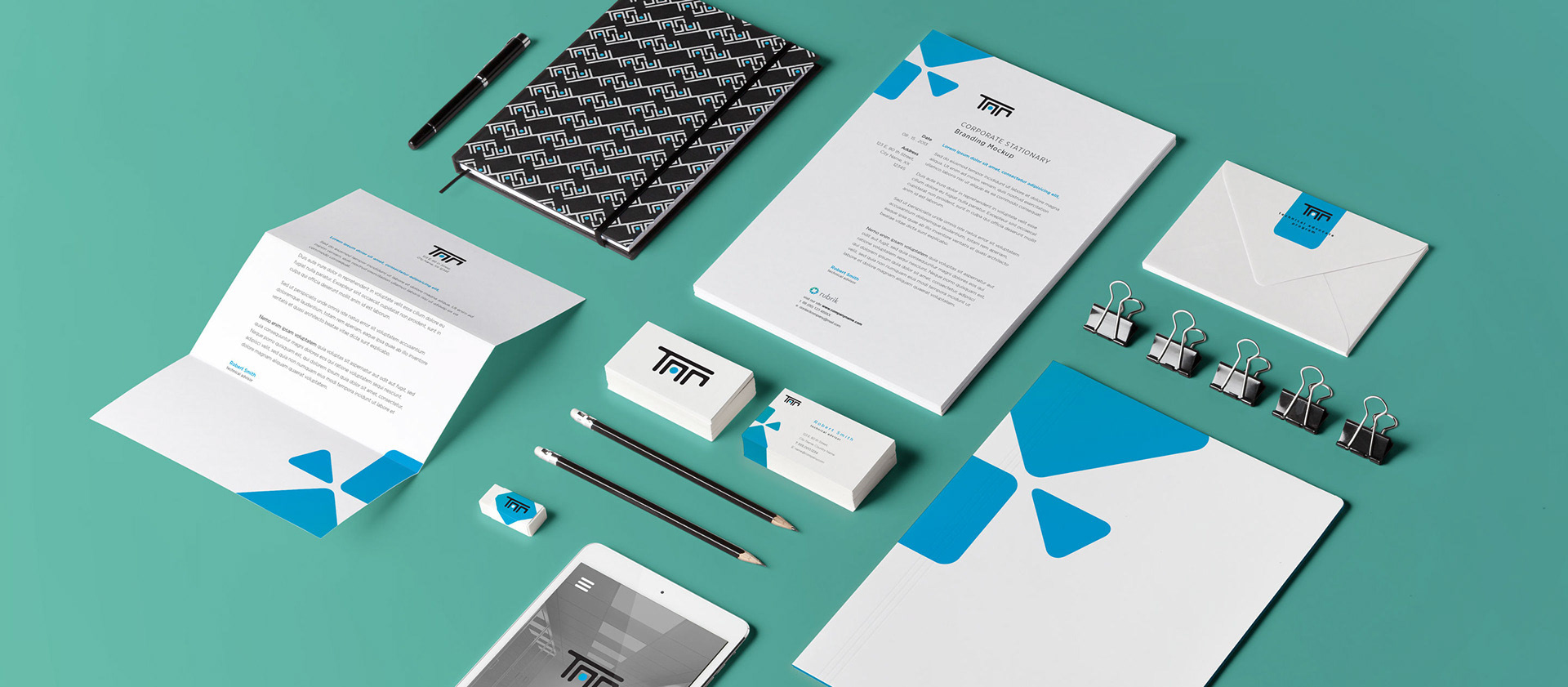
TAP (Technical Advocate Program)
TAP was a sub-branded corporate training program in its prelimary stages of development. The program was to help technical teams/engineers of enterprise clients better use and facilitate the product. There would be class modules, online testing and a welcome kit for attendees.

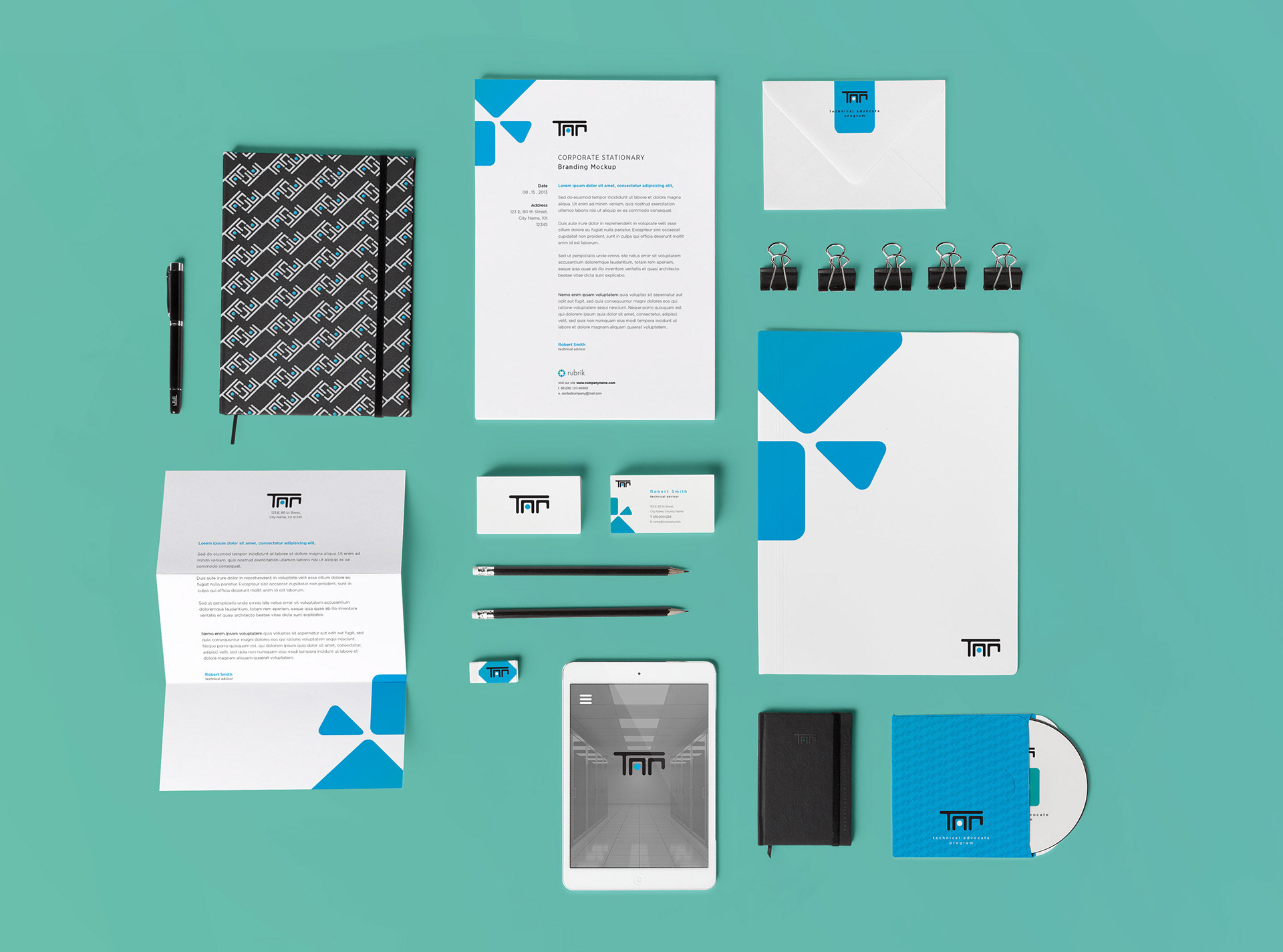
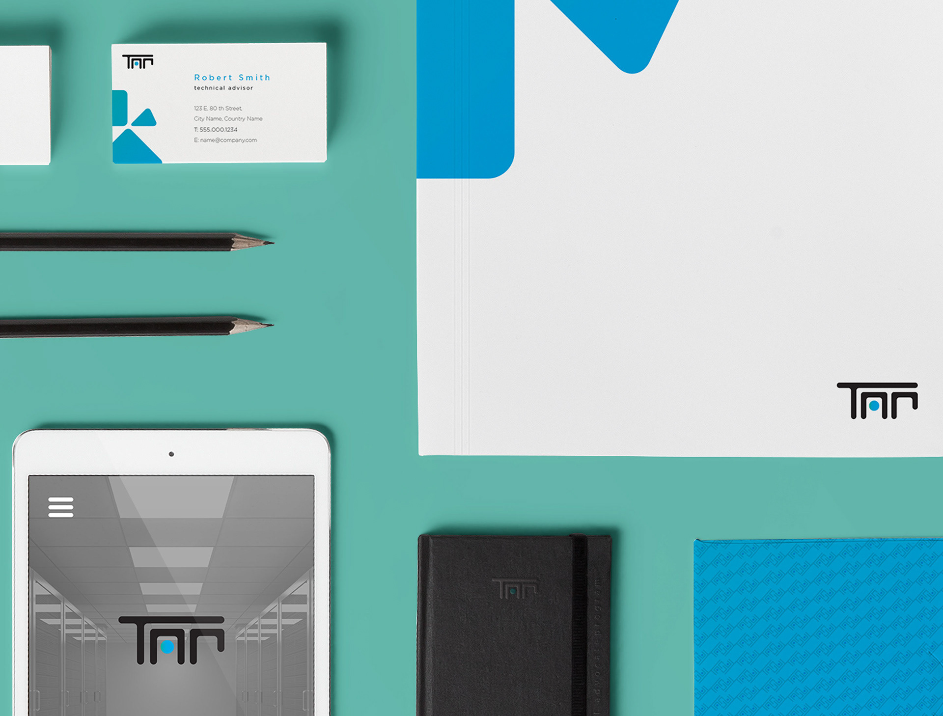
Solution: The logo was inspired by the geometric shapes and colors of the original core brand. An element of the mother logo is shown above (the diamond) and is reflected in the TAP logo with its rounded corners and green-blue gradient. The company's product is data protection software and hardware, thus the logo also incorporates those shapes as well. Draft variations of these ideas are seen below.

Mockups of collateral pieces were created. A background pattern from the logo was designed. The pattern resembles circuitry to further connect the ideas of technology, servers and data protection. At the end, the program was renamed thus lending the acronym to become obsolete. So as designers well know – it's back to the drawing board!